Vendor search: The subtle difference

How can you tell if a service is top-quality? Is it because a provider has been in business for 20 years? Or because they simply call themselves a “premium” provider? And what’s the worst that could possibly go wrong if you hire an amateur to save money?
There is now an oversupply of providers in the wedding industry. On the one hand, the many unregulated trades make it easy to start your own business even without the proper training. On the other hand, some providers offer additional services that don’t even fall within their actual area of expertise, just to minimize the number of jobs they have to outsource to third-party providers. And for most of them, everything looks great at first glance when you’re searching for a provider. But how do you spot the subtle differences? Four professionals in their respective fields explain it to you.

Calligraphy
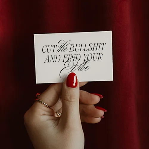
Beautiful handwriting is an art that requires years of practice. Just like a person’s handwriting, a professional calligrapher’s style depends on the artist themselves and cannot be imitated identically by anyone else. Karin Berger of Moderne Kalligrafie has been working as a calligrapher for eight years and explains what makes for beautiful handwriting and why it requires a great deal of experience. These are the characteristics that distinguish a professionally calligraphed piece:
1. Appropriate Amount of Text
As a calligrapher and trained graphic designer, I have an eye for how much white space is needed to create a harmonious overall look. Less is more!
2. Perfect Alignment
If the text appears to be too close to an edge, it’s usually a sign that a professional wasn’t involved. Proper line and character spacing, as well as a consistent font size, are also very important. The exception is when individual, larger words are used to draw attention to them.
3. Harmony
Typography must be harmonious and consistent—a combination of too many different typefaces can be distracting and create a sense of restlessness. The material of the background and the colors used should be chosen carefully.
4. Consider the location
Will the sign be placed on a chair or an easel, hung up, or placed on the floor? Depending on the placement, the viewing height will vary, and this must also be taken into account during the design process. It is especially important with acrylic signs to place them strategically, such as in front of a green area. An easel or similar object in the background can make the sign harder to read!
5. Space for Decorations
Flower arrangements are oftenadded to signs on-site. As a professional, I make sure to leave space for this right from the design stage so that the text isn’t later obscured by the floral decorations.

Photography
Getting started in photography is very accessible these days. You can quickly buy a camera and just get started. This trend allows many creative people to express themselves. However, when it comes to photos of your own wedding, suddenly much more is required from a professional than just a pretty website. Professional photographer Matthias Rhomberg would like to give you a few tips on how to look beyond the surface and avoid making the wrong choices. These signs give away any amateur:
1. The same filter across all photos
Filters, looks, and effects are all the rage on Instagram and other social media platforms. But be careful: they often mask a lack of skill! In my opinion, wedding photos should be timeless, which is why we deliberately avoid short-lived editing trends. After all, who knows if you’ll still like this look 40 years from now?
2. No amazing candid shots or snapshots from throughout the day
It’san art to capture genuine moments completely naturally and to convey them in a visual language that evokes emotion. Don’t let yourself be dazzled by a few impressive landscape shots. Be sure to ask to see several complete, authentic wedding albums! Can the photographer handle challenging lighting conditions, or will they suddenly need a flash in the evening that ruins the whole atmosphere? Are the people all captured beautifully, or do they often have unflattering expressions? Are there plenty of great angles, or do the photos lack the creativity to stand out from the guests’ cell phone snaps?
3. No real weddings in the portfolio
Photographersoften liketo show only pictures from staged photo shoots. They look amazing because they usually feature models in front of an impressive backdrop, photographed with plenty of time and in the best light. And if the shots still didn’t turn out right, they simply don’t show the photos to anyone. At a wedding, however, there are no professional models. You also can’t choose what the weather will be like. The venue looks exactly as it is. You might have just an hour with the bride and groom, and that’s exactly when the best photos have to be taken. So, at a real wedding, make sure to see if the photographer can handle the pressure.
4. Price that’s too low
Will the photographer actually show up at my wedding? Trust your gut about how seriously the photographer takes his responsibilities. A price that’s too low can also be a sign that he might not be able to follow through on his commitment. We’ve repeatedly received last-minute wedding requests from couples whose photographer ended up taking a “cooler” job that came up in the meantime.
5. Insufficient accountability
Yourdigital wedding photos hold irreplaceable memories. What if the camera falls? Or the spare battery is accidentally dead too? Be sure to ask about data security: What happens if the cheap memory card breaks? Where will the raw data be if the computer and hard drives are stolen—or if the house catches fire? Anyone who stammers when asked these questions isn’t taking their responsibility toward the bride and groom seriously. Or they simply don’t know as much about it as a professional does.

Wedding Cake
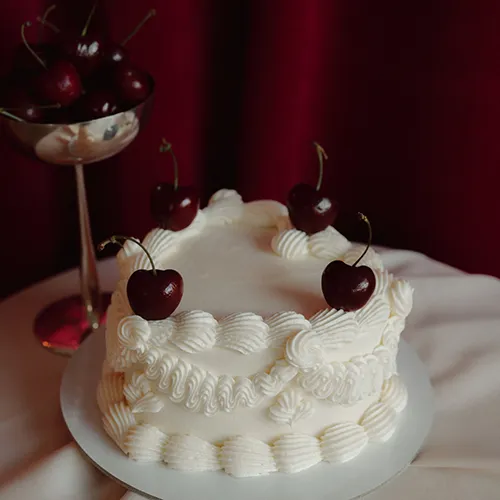
Irmgard Marte (Schokomus) is a master pastry chef with honors and has made over 1,000 wedding cakes in her career. She adheres to a whole range of legal regulations that laypeople are unaware of and knows exactly what needs to be taken into account. Since there are so many amateur pastry chefs in Vorarlberg who—mostly illegally—offer wedding cakes, she’s often compared to them, and unfortunately, this sometimes leads to her expertise not being appreciated—brides even ask her for decorating tips or recipes from “Brigitte.” She explains the important difference between professional patisserie and amateur cakes. Ask these questions to get amateur bakers to open up:
1. What about hygiene?
Amateur bakers usually make cakes in their home kitchens, which are in no way equipped to meet stricthygieneregulations. In the worst-case scenario, this irresponsibility could trigger an epidemic!
2. Is the cold chain maintained?
If the cake cannot be delivered while kept refrigerated at all times or if it takes hours to decorate, the cold chain is broken—a real no-go!
3. Have you ever heard of the Food Act?
There’s a reason there’s a strict law that regulates, among other things, the use of food coloring and additives. As a pastry chef, I’m not allowed to use certain colors at all, or there are strict limits on how much I can use—which is why we can’t simply replicate some of the cakes we see online exactly as they are.
4. Can we taste our cake beforehand?
In most cases, an amateur baker can’t offer a cake for tasting beforehand. The fact that people often place an order anyway—just because the price is right, regardless of how it tastes—is unbelievable to me.
5. How much does the cake cost?
A price that’s too low is a clear sign of unprofessionalism. That’s because amateur bakers usually only factor in the cost of ingredients and the time it takes to make the cake. Discussions, coordinating schedules with the venue or caterer, and delivery, on the other hand, are either not handled at all or not handled professionally.
6. We have 200 guests. Could you please make us a 10-tier cake?
A professional knows from experience what doesn’t work and is happy to say no or offer advice on how to improve things. I would never offer a cake like that—very often, the staff at the wedding venue are completely overwhelmed by it. In this case, I recommend a cake combined with a buffet, where guests can help themselves while the cake is being sliced.
7. Does it really work?
I’ve been asked to step in at the last minute so many times because an amateur pastry chef backed out on the bride and groom. That can’t happen with a professional—because once the order is confirmed and a deposit is paid, the professional is also responsible for their part of the deal.

Stationery
Of course, creativity and a sense of aesthetics play a major role here—and these aren’t things you can learn. Downloading the right software and teaching yourself with YouTube tutorials is already a big step. But of course, not every creative person with InDesign on their computer is automatically a designer. During her training as a media designer, Michelle from Michelle Kreil Design learned, among other things, many important design rules that make it easy to separate the wheat from the chaff. These no-gos give away amateur graphic designers:
1. Too many different fonts
At least two, at most three different fonts are ideal—but only one of them should be distinctive (playful, ornate, etc.), and it should be used sparingly and never in body text. Only professionals have a feel for which fonts combine harmoniously.
2. A Disharmonious Typeface
Incorrect character and line spacing give it away immediately! Especially with cursive fonts, a professional always makes manual adjustments to create a harmonious appearance. With cursive fonts downloaded from the Internet, there’s usually far too much space between the capital letter at the beginning and the following letter. This quickly turns a “Welcome” into a “W illcome.” Without the right software or typographic expertise, it’s impossible to adjust the spacing perfectly.
3. Fonts to Avoid or Standard Fonts
Given the huge selection of wonderful fonts that can now be purchased online (by anyone), it’s absolutely incomprehensible to me that Arial, Comic Sans, Zapfino, and the like are still actually used on wedding stationery. Often, however, low-quality fonts from the internet are used that don’t even include the umlauts and other diacritical marks—a professional adds these marks manually, whereas in amateur designs they’re simply missing or result in an unattractive “ue.”
4. Not Enough White Space
Less is more! When lines of text extend almost to the edge and every bit of empty space is crammed with objects or images, the result is anything but aesthetically pleasing.
5. Continuous text in all caps
It’s incredibly tiring for the reader when an entire block of text is written in all caps. Unfortunately, I’ve seen this happen quite often.
6. 1:1 Image Repetition
Even professional designers use flower illustrations found on the Internet. However, when non-professionals place the same illustration multiple times on a card, it’s immediately obvious that it’s the exact same image over and over again. A professional incorporates a repeating motif in such a way that it doesn’t look like a repeating motif. I don’t just rotate and flip an image—I manually adjust it so that the arrangement of the flowers is clearly different from the first motif placed.
7. Cheap paper, unprofessional printing
At the very least, alarm bells should start ringing when you see 90g paper and a card that looks like you could have printed, cut out, and glued it together yourself at home. Only professional machines can handle heavy-duty (= thick) paper, print with absolute sharpness, and cut perfectly—and that’s absolutely essential for high-quality stationery!

This article covers the following topics:
Created on
20.11.2020
Updated on
1.7.2025